
NC DIVISION OF EMPLOYMENT SECURITY WEBSITE REDESIGN
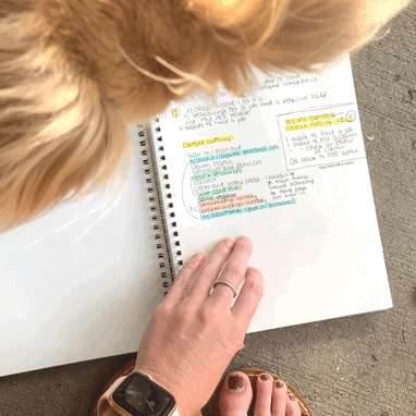
Beginning content outline and low fidelity wireframes. And my dog Finn.
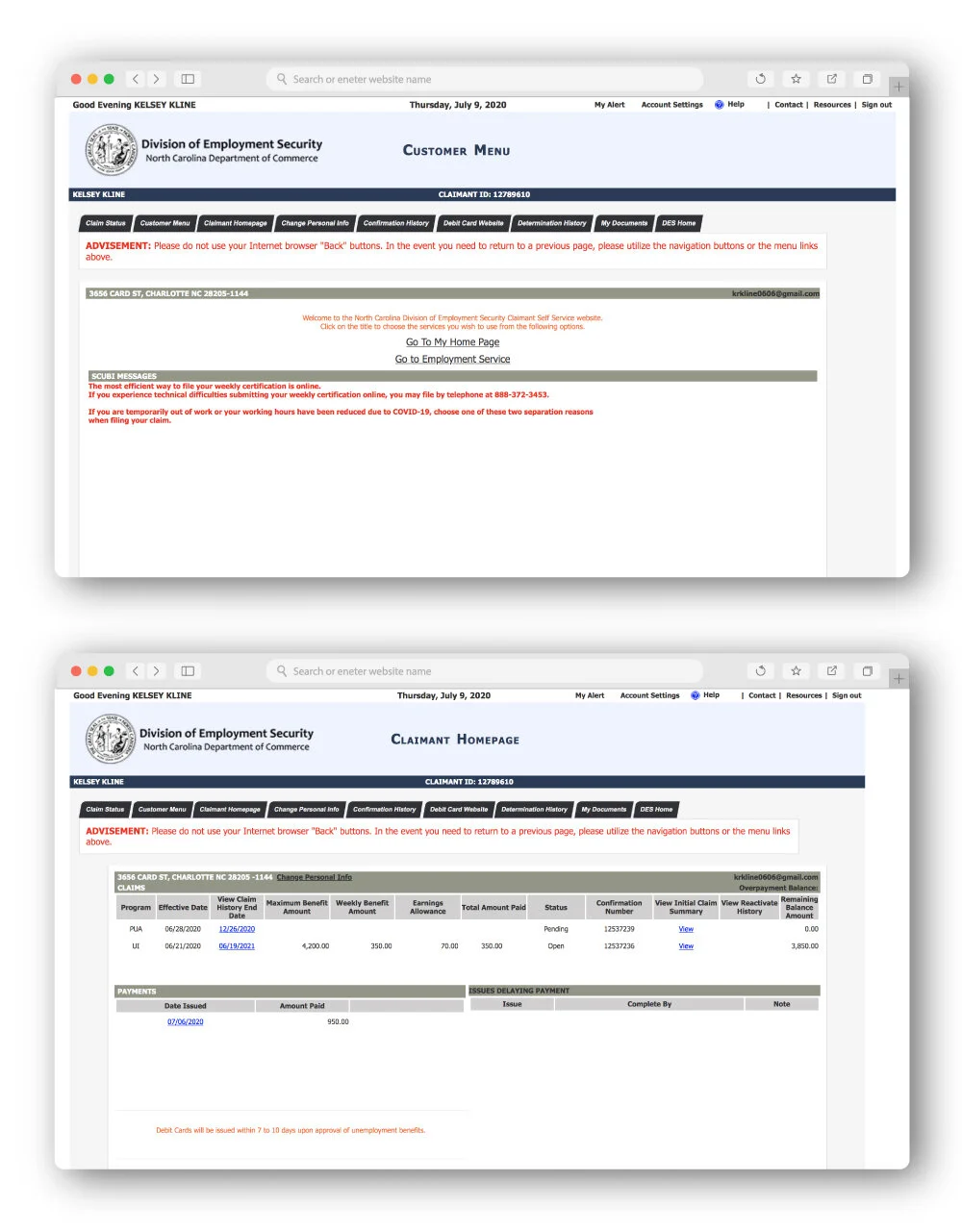
After being furloughed at my nonprofit job in June 2020 due to Covid-19, I went online to the North Carolina Division of Employment Security to sign up for unemployment insurance and realized that the website is nothing short of a nightmare. I decided to redesign it based on my knowledge of UX and UI principles using myself as a first time visitor to the site as a benchmark for my user flow.
Pain points that I sought to address:
Lack of hierarchy
Unclear site architecture — too many tab options
Lack of consistency in typography, spacing and location of CTA
Personal information scattered throughout
Overall aesthetic
tools that i used
Figma
Adobe Illustrator & Photoshop
Google Material Design
Good ol’ pencil, paper and highlighters
BEFORE
AFTER

REVISIONS
In my redesign I made an “ACCOUNT SETTINGS” page that consolidated all personal information instead of having it scattered in headers and on various pages. I also reorganized all claims information into a “CLAIMS CENTER” which would allow for the user to go to one landing page to manage current claims, see updated statuses and errors, and file new claims.
I thought an “I WANT TO…” menu option would be a useful feature to streamline tasks that users frequently seek to accomplish on the site such as “file a claim,” “file weekly certification,” “find a job,” or “check status of claim.”
I stuck to two fonts, header and body, and instead of using red colored text (yikes) to create the intended hierarchy, I used type size, weight and grid placement.
I used two button designs — a filled-in option for important CTA’s and an outlined option for secondary CTA’s.
I was compelled to redesign this website because due to Covid 19, user numbers for the DES site are at an all-time-high. People are scared and their livelihoods are on the line, and having an intuitive platform that people feel confident using would be a small step in easing tension during the pandemic.
